Pythonで測定装置のcsvファイルをグラフ化するアプリを作る(5. ファイルダイアログからのcsv選択編)
続きものの最終回です.こんなのの作り方を公開していきます. drive.google.com
これまで4回に分けて公開しています.
今回はずっと固定だったcsvファイルを選択できるようにします.また以前までのも含めてコードはご自身の責任でご自由にご使用下さい.
目標
ファイルダイアログからcsvを自由に選択,追加できるようにする.
環境
今まで通りPythonでpandasとdashをインストールして下さい.
実装
アップロードされたファイルをデコードする
dashの公式ドキュメントを参考にします.
dcc.Uploadで読み込んだファイルはbase64という形式でエンコードされるそうで,csvとして扱うためにはUTF-8やshift-jisでデコードする必要があります.
Pythonで作ったファイルであればUTF-8になっているはずですし,測定装置から出力されたファイルはshift-jisになっているでしょう.
import base64


# ファイル単体を読み取る関数
def parse_content(contents, filename):
    content_type, content = contents.split(',')
    decode = base64.b64decode(content)
    f = decode.decode('utf-8')# もしくはshift-jis
    try:
        data = COV19().load_string(f)
        info = data.info
        detail = data.data
    except:
        info = detail = None
    return info, detail

# dcc.Uploadの出力を受け取って全ファイルをまとめる関数
def load_contents(contents, filenames):
    info = {}
    detail = {}
    for c, n in zip(contents, filenames):
        info[n], detail[n] = parse_content(c, n)
    info = pd.concat(info).unstack().rename_axis(['Filename'], axis=0)
    detail = pd.concat(detail).rename_axis(
                ['Filename', 'Date'], axis=0).reset_index()
    return info, detail
アップロードされたファイルを表に出力する
既存の表に新規データを追加します.
@app.callback(
    Output('table_info', 'data'),
    Output('table_info', 'columns'),
    Output('store_detail', 'data'),
    inputs={'contents': Input('upload-csv', 'contents')},
    state={
        'filenames': State('upload-csv', 'filename'),
        'col_info': State('table_info', 'columns'),
        'data_info': State('table_info', 'data'),
        'data_detail': State('store_detail', 'data'),# フィルタされているデータに追加すると非表示データが消える
        },
    prevent_initial_call=True
)
def update_csv(
        contents, filenames, col_info, data_info, data_detail):
    if data_info is None:
        df_info = pd.DataFrame()
    else:
        df_info = pd.DataFrame(data_info)
        col_info = pd.MultiIndex.from_tuples([c['name'] for c in col_info])
        df_info = df_info.set_axis(col_info, axis=1).set_index(
                        ('', 'Filename')).rename_axis('Filename', axis=0)
    if data_detail is None:
        df_detail = pd.DataFrame()
    else:
        df_detail = pd.read_json(
                        data_detail, orient='records', convert_dates=['Date'])
    if contents is not None:
        info, detail = load_contents(contents, filenames)
        df_info = pd.concat([df_info, info]).drop_duplicates()
        df_detail = pd.concat([df_detail, detail]).reset_index(
                        drop=True).drop_duplicates()
    col_flat = (['Filename'] + ['_'.join(c) for c in df_info.columns])
    col_multi = [('', 'Filename')] + df_info.columns.to_list()
    df_info = df_info.reset_index().set_axis(col_flat, axis=1)
    columns=[
        {'name': m, 'id': f, 'deletable': True}
            for f, m in zip(col_flat, col_multi)
        ]
    return df_info.to_dict('records'), columns, df_detail.to_json(orient='records')
不要な部分の削除
不要になったので次の記述を削除します.
n_data = 3# 47都道府県+全国を毎回読むのは非効率のため上限を設ける
info = {}
data = {}
for root, dirnames, filenames in os.walk(Path.cwd()):
    for filename in filenames:
        if len(info)>=n_data:
            continue
        if not filename.lower().endswith('.csv'):
            continue
        filepath = Path(root)/filename
        with open(filepath, 'r') as f:
            cov = COV19().load_string(f.read())
        info[filename] = cov.info
        data[filename] = cov.data

df_info = pd.concat(info).unstack().rename_axis(['Filename'], axis=0)
col_flat = (['Filename'] + ['_'.join(c) for c in df_info.columns])
col_multi = [('', 'Filename')] + df_info.columns.to_list()
df_info = df_info.reset_index().set_axis(col_flat, axis=1)

df_detail = pd.concat(data).rename_axis(
            ['Filename', 'Date'], axis=0).reset_index()
表のデータと列も削除します.
table_info = html.Div(
    [dbc.Row(
        [dbc.Col('Info'),
         dbc.Col(
             dcc.Upload(
                 dbc.Button('Upload csv', color='success'),
                 id='upload-csv', multiple=True
                 )
             ),
        ], justify='between',
        ),
     dbc.Row(
        [DataTable(
            #data=df_info.to_dict('records'),
            #columns=[
            #   {'name': m, 'id': f, 'deletable': True}
            #       for f, m in zip(col_flat, col_multi)
            #   ],
            id='table_info', editable=True, filter_action='native',
            sort_action='native', merge_duplicate_headers=True,
            row_selectable='multi', row_deletable=True,
            style_table={'overflow': 'auto', 'height': '40vh'},
            ),
        ]
        )
     ]
 )

table_detail = html.Div(
    ['Data',
     DataTable(
         #data=df_detail.to_dict('records'),
         #columns=[{'name': i, 'id': i} for i in df_detail.columns],
         id='table_detail', editable=True, filter_action='native',
         sort_action='native',
         style_table={'overflow': 'scroll', 'height': '40vh'}
         ),
     dcc.Store(id='store_detail')#, data=df_detail.to_json(orient='records')),
    ]
)
ようやく完成です.
完成したコード全体
ご自身の責任でご自由に使用,改変,再配布して下さい.
from io import StringIO
import base64

import pandas as pd

from dash import Dash, html, dcc
from dash import Input, State, Output
from dash.dash_table import DataTable
import dash_daq as daq
import dash_bootstrap_components as dbc

from plotly import express as px
from plotly import graph_objects as go


class COV19(object):
    def load_string(self, string):
        header, info, data = string.split('\n\n')
        self.header = pd.Series(StringIO(header))
        self.info = pd.read_csv(StringIO(info), header=0, index_col=0)
        self.data = pd.read_csv(StringIO(data), header=0, index_col=0,
                                parse_dates=['Date'])
        return self

    def load_file(self, filepath):
        with open(filepath, 'r') as f:
            self.load_string(f.read())
        return self


class Components(object):
    def __init__(self, name):
        self.name = name

    def make_dropdown(self, multi=False):
        return dbc.Row(
    [dbc.Col(f'{self.name}'),
     dbc.Col(
         dcc.Dropdown(
             options=[], value=None, multi=multi, id=f'graph-{self.name}',
             className='dbc', style={'width': '15vw', 'float': 'right'},
            )
         ),
    ],
    )

    def make_button(self):
        return dbc.Button(
          'advanced settings', n_clicks=0,
          id=f'{self.name}-button', size='sm', style={'width': '7vw'},
        )

    def make_range(self):
        return [
           html.Div('Range', style={'text-align': 'center'}),
           dbc.InputGroup(
               [dbc.Input(
                    placeholder='min', id=f'{self.name}min', type='number',
                    ),
                dbc.InputGroupText('–'),
                dbc.Input(
                    placeholder='max', id=f'{self.name}max', type='number',
                    ),
               ],
               ),
        ]

    def make_toggle(self):
        return daq.BooleanSwitch(
                on=False, id=f'graph-log_{self.name}',
                label=f'log {self.name}', labelPosition='top',
                )

    def make_errorbar(self):
        return [
           html.Div(
                'Error bar', style={'text-align': 'center'},
               ),
           dbc.InputGroup(
               [dbc.Input(
                    placeholder='None or lower limit',
                    id=f'error_{self.name}_minus', type='number',
                    ),
                dbc.InputGroupText('–'),
                dbc.Input(
                    placeholder='size or upper limit',
                    id=f'error_{self.name}', type='number',
                    ),
               ],
               ),
        ]

    def make_collapse(self):
        button = self.make_button()
        options = dbc.Row(
                        [dbc.Col(self.make_range()), dbc.Col(self.make_toggle())])
        collapse = dbc.Collapse(
                        options, is_open=False, id=f'{self.name}_collapse')
        return dbc.Col(
            [button, collapse],
            width={'offset': 1}, style={'padding-bottom': '10pt'},
        )


class Axis(Components):
    def make_component(self, multi=False):
        components = [self.make_dropdown(multi), self.make_collapse()]
        return html.Div(components)


dbc_css = "https://cdn.jsdelivr.net/gh/AnnMarieW/dash-bootstrap-templates/dbc.min.css"
app = Dash(external_stylesheets=[dbc.themes.DARKLY, dbc_css])


table_info = html.Div(
    [dbc.Row(
        [dbc.Col('Info'),
         dbc.Col(
             dcc.Upload(
                 dbc.Button('Upload csv', color='success'),
                 id='upload-csv', multiple=True
                 )
             ),
        ], justify='between',
        ),
     dbc.Row(
        [DataTable(
            id='table_info', editable=True, filter_action='native',
            sort_action='native', merge_duplicate_headers=True,
            row_selectable='multi', row_deletable=True,
            style_table={'overflow': 'auto', 'height': '40vh'},
            ),
        ]
        )
     ]
 )

table_detail = html.Div(
    ['Data',
     DataTable(
         id='table_detail', editable=True, filter_action='native',
         sort_action='native',
         style_table={'overflow': 'scroll', 'height': '40vh'}
         ),
     dcc.Store(id='store_detail'),
    ]
)

graph_type = dbc.Row(
    [dbc.Col(['Graph type']),
     dbc.Col(
         [dcc.Dropdown(
                options=[
                    {'label': '散布図','value': 'scatter'},
                    {'label': '折線', 'value': 'line'},
                    {'label': '棒', 'value': 'box'},
                    {'label': 'ヒストグラム', 'value': 'histogram'},
                    {'label': '円', 'value': 'pie'},
                    {'label': '散布図行列', 'value': 'scatter_matrix'},
                    ],
                id='graph-type', value=None,
                className='dbc', style={'width': '15vw', 'float': 'right'},
                ),
         ]
         ),
    ]
)

graph = [dbc.Row(dbc.Col(html.H5(['Graph']))),
         dbc.Row(
            [dbc.Col(width=0), dbc.Col(dcc.Graph(id='graph')), dbc.Col(width=0)],
            justify='center'
            ),
        ]

graph_settings = [
    html.H5(['Settings']),
    graph_type,
    Axis('x').make_component(multi=True),
    Axis('y').make_component(multi=False),
    Axis('z').make_component(multi=False),
    Components('color').make_dropdown(),
    Components('symbol').make_dropdown(),
    Components('facet_col').make_dropdown(),
    Components('facet_row').make_dropdown(),
    Components('text').make_dropdown(),
    Components('hover_name').make_dropdown(),
    dbc.Row(
        [dbc.Col(
             dbc.InputGroup(
                 [dbc.InputGroupText('width'),
                  dbc.Input(value=600, type='number', id='graph-width'),
                  dbc.InputGroupText('pixel')
                 ]
                 )
             ),
         dbc.Col(
             dbc.InputGroup(
                 [dbc.InputGroupText('height'),
                  dbc.Input(type='number', value=400, id='graph-height'),
                  dbc.InputGroupText('pixel')
                 ],
                 )
             )
        ],
        ),
]

container = [
    dbc.Row(
        [dbc.Col(graph_settings, width=3, class_name='bg-secondary',
                 style={'height': '60vh', 'overflow': 'scroll'},
            ),
         dbc.Col(
             graph, width=9, style={'height': '60vh', 'overflow': 'scroll'}),
        ],
        ),
    dbc.Row(
        [dbc.Col(table_info, width=8, class_name='bg-info text-black'),
         dbc.Col(table_detail, width=4, class_name='bg-primary text-black'),
        ], style={'height': '40vh'},
        ),
]
app.layout = dbc.Container(container, fluid=True)


@app.callback(
    Output('table_detail', 'data'),
    Output('table_detail', 'columns'),
    Input('table_info', 'derived_virtual_selected_rows'),
    Input('store_detail', 'data'),
    State('table_info', 'derived_virtual_data'),
    #prevent_initial_call=True,
)
def select_file(selected_rows, data_detail, data_info):
    if data_info is None:
        data_info = []
    df_info = pd.DataFrame(data_info)
    if data_detail is None:
        df_detail = pd.DataFrame()
    else:
        df_detail = pd.read_json(
                        data_detail, orient='records', convert_dates=['Date'])
    if selected_rows is None:
        selected_rows = []
    if len(selected_rows)!=0:
        filenames = df_info['Filename'].iloc[selected_rows].to_list()
        df_detail = df_detail.loc[
            lambda d: d['Filename'].apply(lambda x: x in filenames)
        ]
    columns=[{'name': i, 'id': i} for i in df_detail.columns]
    return df_detail.to_dict('records'), columns


def drawer_px(graph_type, graph_kws, axis_ranges, log_axis):
    if graph_type!='scatter_matrix':
        graph_kws['x'] = graph_kws['x'][0]
    if graph_type=='scatter':
        if graph_kws['z'] is None:
            drawer = px.scatter
            graph_kws.pop('z')
        else:
            drawer = px.scatter_3d
            graph_kws.pop('facet_col')
            graph_kws.pop('facet_row')
    elif graph_type=='line':
        if graph_kws['z'] is None:
            drawer = px.line
            graph_kws.pop('z')
        else:
            drawer = px.line_3d
            graph_kws.pop('facet_col')
            graph_kws.pop('facet_row')
    else:
        graph_kws.pop('z')
        graph_kws.pop('text')
        drawer = None
        if graph_type=='box':
            drawer = px.box
            graph_kws.pop('symbol')
        elif graph_type=='histogram':
            drawer = px.histogram
            graph_kws.pop('symbol')
        elif graph_type=='pie':
            graph_kws.pop('symbol')
            drawer = px.pie
            graph_kws['names'] = graph_kws.pop('x')
            graph_kws['values'] = graph_kws.pop('y')
        elif graph_type=='scatter_matrix':
            drawer = px.scatter_matrix
            graph_kws['dimensions'] = graph_kws.pop('x')
            graph_kws.pop('y')
            graph_kws.pop('facet_col')
            graph_kws.pop('facet_row')

    for key in 'xyz':
        if key not in graph_kws.keys():
            continue
        keymin = axis_ranges[f'{key}min']
        keymax = axis_ranges[f'{key}max']
        if (keymin is not None
            and keymax is not None
            ):
            graph_kws[f'range_{key}'] = [keymin, keymax]
        graph_kws[f'log_{key}'] = log_axis[f'log_{key}']
    return drawer, graph_kws


dropdowns = ['x', 'y', 'z', 'color', 'symbol',
             'facet_col', 'facet_row', 'text', 'hover_name'
            ]


@app.callback(
    Output('graph', 'figure'),
    inputs={
        'data_info': Input('table_info', 'derived_virtual_data'),
        'data_detail': Input('table_detail', 'derived_virtual_data'),
        'graph_type': Input('graph-type', 'value'),
        'graph_kws': {
            key: Input(f'graph-{key}', 'value')
                for key in dropdowns + ['width', 'height']
            },
        'log_axis': {f'log_{x}': Input(f'graph-log_{x}', 'on') for x in 'xyz'},
        'axis_ranges': {
            f'{key}': Input(f'{key}', 'value')
                for key in [f'{x}min' for x in 'xyz']+[f'{x}max' for x in 'xyz']
            },
        },
    prevent_initial_call=True,
)
def update_graph(
        data_info, data_detail, graph_kws, axis_ranges, log_axis, graph_type,
    ):
    if len(data_info)==0:
        return go.Figure()
    df = pd.DataFrame(data_info)
    if len(data_detail)!=0:
        df = df.join(pd.DataFrame(data_detail).set_index('Filename'),
                     on='Filename', how='inner'
              ).reset_index()
    if graph_kws['x'] is None:
        graph_kws['x'] = [None]
    if len(graph_kws['x'])==1 or graph_type=='scatter_matrix':
        drawer, graph_kws = drawer_px(
                    graph_type, graph_kws, axis_ranges, log_axis
                    )
        try:
            fig = drawer(df, **graph_kws)
        except:
            fig = go.Figure()
    else:
        fig = go.Figure()
    return fig


for arg in dropdowns:
    @app.callback(
            Output(f'graph-{arg}', 'options'),
            Input('table_info', 'columns'),
            Input('table_detail', 'columns'),
            prevent_initial_call=True
        )
    def update_dropdown(col_info, col_detail):
        if col_info is None:
            col_info = []
        if col_detail is None:
            col_detail = []
        col = ['_'.join(c['name']) if c['name'][0]!='' else c['name'][1]
                for c in col_info
              ]
        col += [c['name'] for c in col_detail]
        return list(set(col))


for btn in list('xyz'):
    @app.callback(
            Output(f'{btn}_collapse', 'is_open'),
            Input(f'{btn}-button', 'n_clicks'),
            State(f'{btn}_collapse', 'is_open'),
            prevent_initial_call=True
        )
    def open_collapse(clicks, is_open):
        return not is_open


def parse_content(contents, filename):
    content_type, content = contents.split(',')
    decode = base64.b64decode(content)
    f = decode.decode('utf-8')
    try:
        data = COV19().load_string(f)
        info = data.info
        detail = data.data
    except:
        info = detail = None
    return info, detail


def load_contents(contents, filenames):
    info = {}
    detail = {}
    for c, n in zip(contents, filenames):
        info[n], detail[n] = parse_content(c, n)
    info = pd.concat(info).unstack().rename_axis(['Filename'], axis=0)
    detail = pd.concat(detail).rename_axis(
                ['Filename', 'Date'], axis=0).reset_index()
    return info, detail


@app.callback(
    Output('table_info', 'data'),
    Output('table_info', 'columns'),
    Output('store_detail', 'data'),
    inputs={'contents': Input('upload-csv', 'contents')},
    state={
        'filenames': State('upload-csv', 'filename'),
        'col_info': State('table_info', 'columns'),
        'data_info': State('table_info', 'data'),
        'data_detail': State('store_detail', 'data'),
        },
    prevent_initial_call=True
)
def update_csv(
        contents, filenames, col_info, data_info, data_detail):
    if data_info is None:
        df_info = pd.DataFrame()
    else:
        df_info = pd.DataFrame(data_info)
        col_info = pd.MultiIndex.from_tuples([c['name'] for c in col_info])
        df_info = df_info.set_axis(col_info, axis=1).set_index(
                        ('', 'Filename')).rename_axis('Filename', axis=0)
    if data_detail is None:
        df_detail = pd.DataFrame()
    else:
        df_detail = pd.read_json(
                        data_detail, orient='records', convert_dates=['Date'])
    if contents is not None:
        info, detail = load_contents(contents, filenames)
        df_info = pd.concat([df_info, info]).drop_duplicates()
        df_detail = pd.concat([df_detail, detail]).reset_index(
                        drop=True).drop_duplicates()
    col_flat = (['Filename'] + ['_'.join(c) for c in df_info.columns])
    col_multi = [('', 'Filename')] + df_info.columns.to_list()
    df_info = df_info.reset_index().set_axis(col_flat, axis=1)
    columns=[
        {'name': m, 'id': f, 'deletable': True}
            for f, m in zip(col_flat, col_multi)
        ]
    return df_info.to_dict('records'), columns, df_detail.to_json(orient='records')


if __name__=='__main__':
    app.run_server(debug=True)
感想
便利だけど実際のcsvを扱うための変換が必要なのが面倒.今回は回避できたけど同じ出力先を持つコールバック関数は1つまでという制限も苦しい.
Pythonで測定装置のcsvファイルをグラフ化するアプリを作る(4. グラフ種類の変更編)
続きものです.こんなのの作り方を公開していきます. drive.google.com
これまで3回に分けて公開しています.
今回は散布図以外のグラフも描画できるようにします.以前までのも含めてコードはご自身の責任でご自由にご使用下さい.
目標
折線,棒,ヒストグラム,円,散布図行列を実装する.
環境
今まで通りPythonでpandasとdashをインストールして下さい.
実装
グラフの種類を選べるプルダウンを作成する
軸のように表に合わせて選択肢を変える必要はないので打ち込んで完成です.
graph_type = dbc.Row(
    [dbc.Col(['Graph type']),
     dbc.Col(
         [dcc.Dropdown(
                options=[
                    {'label': '散布図','value': 'scatter'},
                    {'label': '折線', 'value': 'line'},
                    {'label': '棒', 'value': 'box'},
                    {'label': 'ヒストグラム', 'value': 'histogram'},
                    {'label': '円', 'value': 'pie'},
                    {'label': '散布図行列', 'value': 'scatter_matrix'},
                    ],
                id='graph-type', value=None,
                className='dbc', style={'width': '15vw', 'float': 'right'},
                ),
         ]
         ),
    ]
)

graph_settings = [
    html.H5(['Settings']),
    graph_type,# 追加
    Axis('x').make_component(multi=True),
    Axis('y').make_component(multi=False),
    Axis('z').make_component(multi=False),
    Components('color').make_dropdown(),
    Components('symbol').make_dropdown(),
    Components('facet_col').make_dropdown(),
    Components('facet_row').make_dropdown(),
    Components('text').make_dropdown(),
    Components('hover_name').make_dropdown(),
    dbc.Row(
        [dbc.Col(
             dbc.InputGroup(
                 [dbc.InputGroupText('width'),
                  dbc.Input(value=600, type='number', id='graph-width'),
                  dbc.InputGroupText('pixel')
                 ]
                 )
             ),
         dbc.Col(
             dbc.InputGroup(
                 [dbc.InputGroupText('height'),
                  dbc.Input(type='number', value=400, id='graph-height'),
                  dbc.InputGroupText('pixel')
                 ],
                 )
             )
        ],
        ),
]
選択肢に合わせて描画する関数を追加する
グラフを生成する関数とアプリに表示する関数を分けます.生成関数を次のように作ります. 描画関数によって受け取れる引数が異なることへの対応が主な処理になっています.
def drawer_px(graph_type, graph_kws, axis_ranges, log_axis):
    if graph_type!='scatter_matrix':
        # 散布図行列以外は軸のパラメータを1つだけ受け取る
        graph_kws['x'] = graph_kws['x'][0]
    # plotly.expressの関数を選択する
    # 散布図と折線は3次元用の関数があるためz軸を与えられたかでさらに分岐する
    if graph_type=='scatter':
        if graph_kws['z'] is None:
            drawer = px.scatter
            graph_kws.pop('z')
        else:
            drawer = px.scatter_3d
            graph_kws.pop('facet_col')
            graph_kws.pop('facet_row')
    elif graph_type=='line':
        if graph_kws['z'] is None:
            drawer = px.line
            graph_kws.pop('z')
        else:
            drawer = px.line_3d
            graph_kws.pop('facet_col')
            graph_kws.pop('facet_row')
    else:
        graph_kws.pop('z')
        graph_kws.pop('text')
        drawer = None
        if graph_type=='box':
            drawer = px.box
            graph_kws.pop('symbol')
        elif graph_type=='histogram':
            drawer = px.histogram
            graph_kws.pop('symbol')
        elif graph_type=='pie':
            graph_kws.pop('symbol')
            drawer = px.pie
            graph_kws['names'] = graph_kws.pop('x')
            graph_kws['values'] = graph_kws.pop('y')
        elif graph_type=='scatter_matrix':
            drawer = px.scatter_matrix
            graph_kws['dimensions'] = graph_kws.pop('x')
            graph_kws.pop('y')
            graph_kws.pop('facet_col')
            graph_kws.pop('facet_row')

    for key in 'xyz':
        if key not in graph_kws.keys():
            continue
        keymin = axis_ranges[f'{key}min']
        keymax = axis_ranges[f'{key}max']
        if (keymin is not None
            and keymax is not None
            ):
            graph_kws[f'range_{key}'] = [keymin, keymax]
        graph_kws[f'log_{key}'] = log_axis[f'log_{key}']
    return drawer, graph_kws
アプリへグラフを表示する関数は次のように書き換えます.
@app.callback(
    Output('graph', 'figure'),
    inputs={
        'data_info': Input('table_info', 'derived_virtual_data'),
        'data_detail': Input('table_detail', 'derived_virtual_data'),
        'graph_type': Input('graph-type', 'value'),
        'graph_kws': {
            key: Input(f'graph-{key}', 'value')
                for key in dropdowns + ['width', 'height']
            },
        'log_axis': {f'log_{x}': Input(f'graph-log_{x}', 'on') for x in 'xyz'},
        'axis_ranges': {
            f'{key}': Input(f'{key}', 'value')
                for key in [f'{x}min' for x in 'xyz']+[f'{x}max' for x in 'xyz']
            },
        },
    prevent_initial_call=True,
)
def update_graph(
        data_info, data_detail, graph_kws, axis_ranges, log_axis, graph_type,
    ):
    if len(data_info)==0:
        return go.Figure()
    df = pd.DataFrame(data_info)
    if len(data_detail)!=0:
        df = df.join(pd.DataFrame(data_detail).set_index('Filename'),
                     on='Filename', how='inner'
              ).reset_index()
    if graph_kws['x'] is None:
        graph_kws['x'] = [None]
    if len(graph_kws['x'])==1 or graph_type=='scatter_matrix':
        # plotly.expressの関数とそれに直接渡せるキーワード引数を受け取る
        drawer, graph_kws = drawer_px(
                    graph_type, graph_kws, axis_ranges, log_axis
                    )
        try:
            fig = drawer(df, **graph_kws)
        except:
            fig = go.Figure()
    else:
        fig = go.Figure()
    return fig
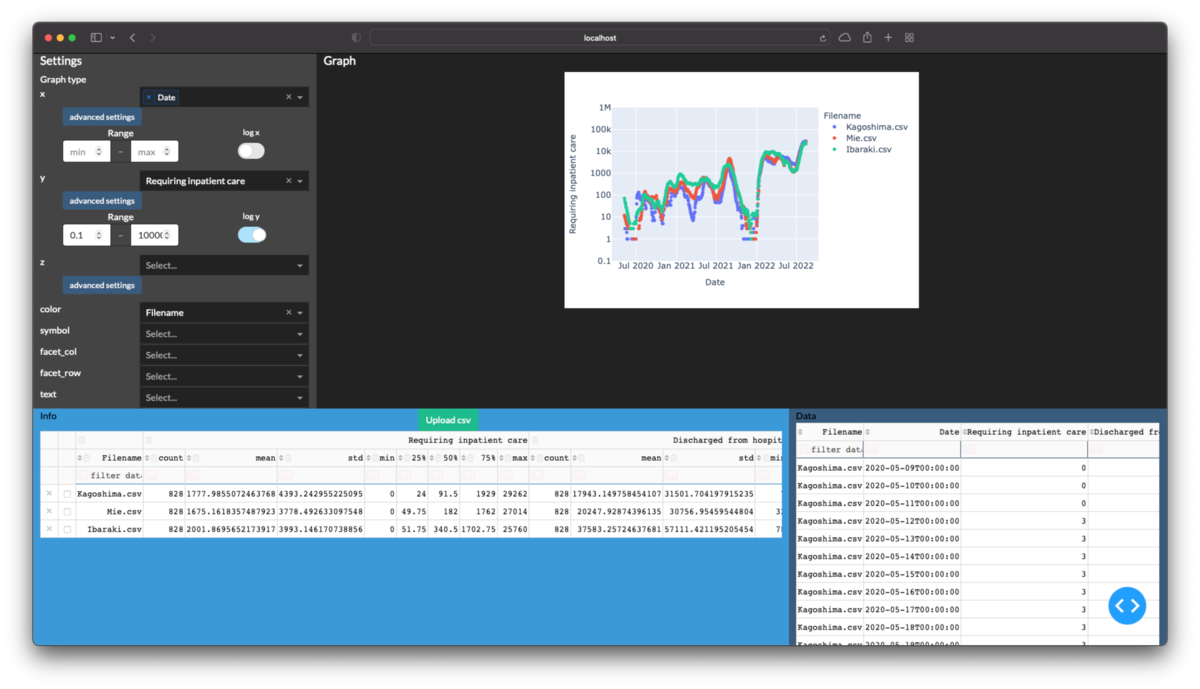
ここまでできると3次元の折線グラフや散布図行列は次のように描画できます.

次回
Pythonで測定装置のcsvファイルをグラフ化するアプリを作る(3. グラフ調整編)
前々回からの続きものです.こんなのの作り方を公開していきます. drive.google.com
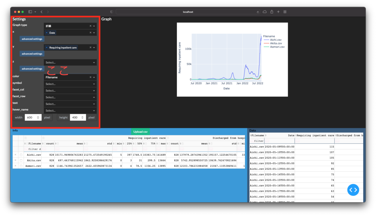
今回はグラフのx, y軸などを調整する部分を作成します.
目標
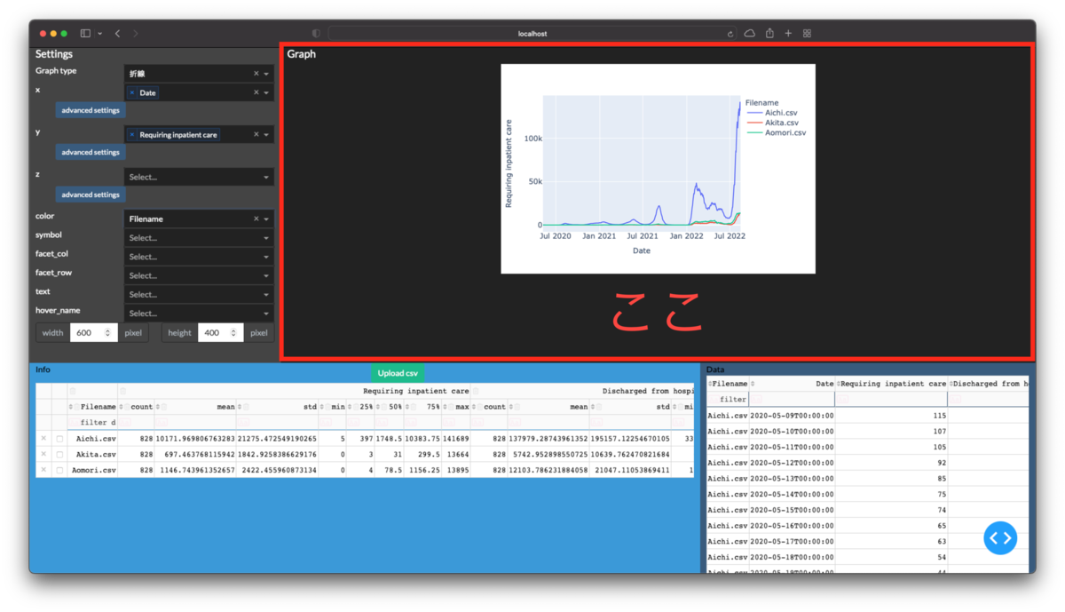
下図の赤枠部分を作成します.
開発環境
初回から追加ありません.Pythonでpandasとdashをインストールして下さい.
グラフの設定項目の作成
軸や色分けなどを選択できるプルダウンを配置する
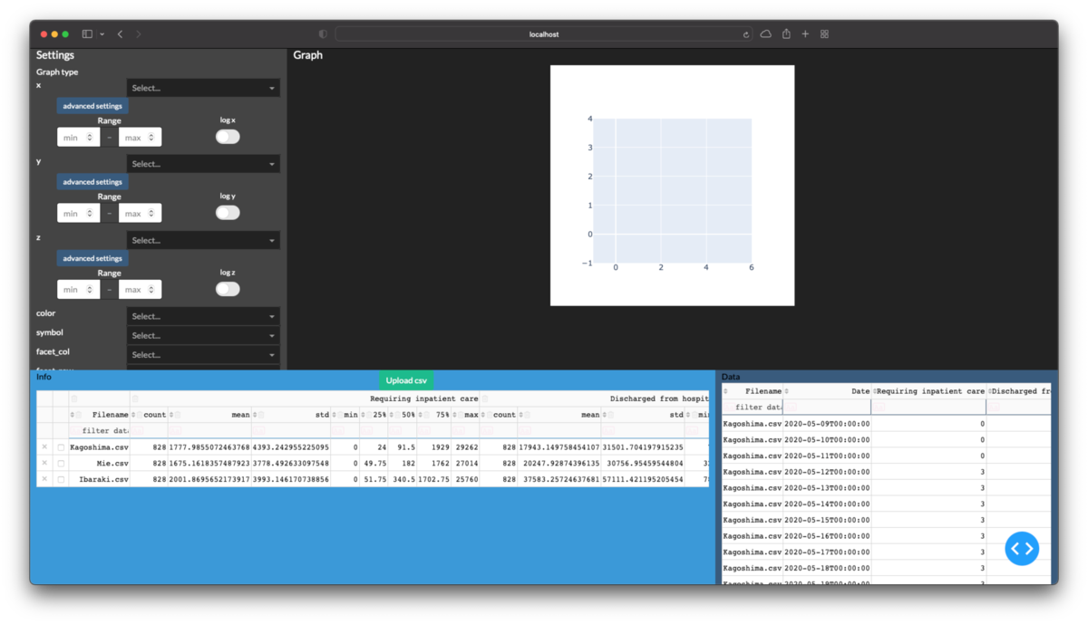
x, y, z, 色, 点や線の種類, 列, 行, 各点のラベル, マウスオーバー時の表示項目をプルダウンで選択できるようにします. これらは項目名が違うだけで中身はほぼ同じです.従ってこのようなパーツを生成するクラスというか関数群をまず作ります.
class Components(object):
    """グラフの設定項目を選択するパーツを生成します.
    Attribute
    ----------
    name: str
        plotly.expressの関数に渡すキーワード引数の名前.

    Methods
    ----------
    make_dropdown(multi): 設定項目を選択するためのプルダウンを生成します.
    make_button(): 高度な設定を表示するためのボタンを生成します.
    make_range(): 数字の上下限を設定するための入力ボックスを生成します.
    make_toggle(): 軸の常用対数表示を切り替えるスイッチを生成します.
    make_errorbar(): エラーバーの範囲を設定するための入力ボックスを生成します.ただし動作未確認.
    make_collapse(): ボタンで表示と非表示が切り替わる高度な設定を生成します.
    """
    def __init__(self, name):
        self.name = name

    def make_dropdown(self, multi=False):
        return dbc.Row(
    [dbc.Col(f'{self.name}'),
     dbc.Col(
         dcc.Dropdown(
             options=[], value=None, multi=multi, id=f'graph-{self.name}',
             className='dbc', style={'width': '15vw', 'float': 'right'},
            )
         ),
    ],
    )

    def make_button(self):
        return dbc.Button(
          'advanced settings', n_clicks=0,
          id=f'{self.name}-button', size='sm', style={'width': '7vw'},
        )

    def make_range(self):
        return [
           html.Div('Range', style={'text-align': 'center'}),
           dbc.InputGroup(
               [dbc.Input(
                    placeholder='min', id=f'{self.name}min', type='number',
                    ),
                dbc.InputGroupText('–'),
                dbc.Input(
                    placeholder='max', id=f'{self.name}max', type='number',
                    ),
               ],
               ),
        ]

    def make_toggle(self):
        return daq.BooleanSwitch(
                on=False, id=f'graph-log_{self.name}',
                label=f'log {self.name}', labelPosition='top',
                )

    def make_errorbar(self):
        return [
           html.Div(
                'Error bar', style={'text-align': 'center'},
               ),
           dbc.InputGroup(
               [dbc.Input(
                    placeholder='None or lower limit',
                    id=f'error_{self.name}_minus', type='number',
                    ),
                dbc.InputGroupText('–'),
                dbc.Input(
                    placeholder='size or upper limit',
                    id=f'error_{self.name}', type='number',
                    ),
               ],
               ),
        ]

    def make_collapse(self):
        button = self.make_button()
        options = dbc.Row(
                        [dbc.Col(self.make_range()), dbc.Col(self.make_toggle())])
        collapse = dbc.Collapse(
                        options, is_open=False, id=f'{self.name}_collapse')
        return dbc.Col(
            [button, collapse],
            width={'offset': 1}, style={'padding-bottom': '10pt'},
        )


class Axis(Components):
    """高度な設定を含む軸を選択します.
    Method
    ----------
    make_component(multi): 軸を選択するドロップダウンと高度な設定を行うボタンを生成します.
    """
    def make_component(self, multi=False):
        components = [self.make_dropdown(multi), self.make_collapse()]
        return html.Div(components)
これを使ってグラフの設定項目を選択する部分を作ってcontainerに反映します.
graph_settings = [
    html.H5(['Settings']),
    'Graph type',# 後で中身を作ります
    Axis('x').make_component(multi=True),# 複数選択できるようにした理由は後で散布図行列を使うためです
    Axis('y').make_component(multi=False),
    Axis('z').make_component(multi=False),
    Components('color').make_dropdown(),
    Components('symbol').make_dropdown(),
    Components('facet_col').make_dropdown(),
    Components('facet_row').make_dropdown(),
    Components('text').make_dropdown(),
    Components('hover_name').make_dropdown(),
    dbc.Row(
        [dbc.Col(
             dbc.InputGroup(
                 [dbc.InputGroupText('width'),
                  dbc.Input(value=600, type='number', id='graph-width'),
                  dbc.InputGroupText('pixel')
                 ]
                 )
             ),
         dbc.Col(
             dbc.InputGroup(
                 [dbc.InputGroupText('height'),
                  dbc.Input(type='number', value=400, id='graph-height'),
                  dbc.InputGroupText('pixel')
                 ],
                 )
             )
        ],
        ),
]

container = [
    dbc.Row(
        [dbc.Col(graph_settings, width=3, class_name='bg-secondary',
                 style={'height': '60vh', 'overflow': 'scroll'},
            ),
         dbc.Col(
             graph, width=9, style={'height': '60vh', 'overflow': 'scroll'}),
        ],
        ),
    dbc.Row(
        [dbc.Col(table_info, width=8, class_name='bg-info text-black'),
         dbc.Col(table_detail, width=4, class_name='bg-primary text-black'),
        ], style={'height': '40vh'},
        ),
]
表の列名をプルダウンに自動で反映させる
作成したプルダウンは中身が空でまだ何も選択できません.ここからグラフに何を表示するか選べるようにするには,csvの表から列名を抽出する必要があります. この操作は表が更新された時に実行されるようにします.
dropdowns = ['x', 'y', 'z', 'color', 'symbol',
             'facet_col', 'facet_row', 'text', 'hover_name'
            ]

for arg in dropdowns:
    # なぜか上書きされずに全てのドロップダウンの設定に成功する
    @app.callback(
            Output(f'graph-{arg}', 'options'),
            Input('table_info', 'columns'),
            Input('table_detail', 'columns'),
            prevent_initial_call=True
        )
    def update_dropdown(col_info, col_detail):
        if col_info is None:
            col_info = []
        if col_detail is None:
            col_detail = []
        col = ['_'.join(c['name']) if c['name'][0]!='' else c['name'][1]
                for c in col_info
              ]
        col += [c['name'] for c in col_detail]
        return list(set(col))
ドロップダウンで選択したパラメータをグラフに反映させる
前回作成したグラフ描画用の関数を書き換えます.
dropdowns = ['x', 'y', 'z', 'color', 'symbol',
             'facet_col', 'facet_row', 'text', 'hover_name'
            ]

@app.callback(
    Output('graph', 'figure'),
    inputs={
        'data_info': Input('table_info', 'derived_virtual_data'),
        'data_detail': Input('table_detail', 'derived_virtual_data'),
        'graph_kws': {# グラフの設定項目をまとめて渡す
            key: Input(f'graph-{key}', 'value')
                for key in dropdowns + ['width', 'height']
            },
        },
    prevent_initial_call=True,
)
def update_graph(
        data_info, data_detail, graph_kws,
    ):
    if len(data_info)==0:
        return go.Figure()
    df = pd.DataFrame(data_info)
    if len(data_detail)!=0:
        df = df.join(pd.DataFrame(data_detail).set_index('Filename'),
                     on='Filename', how='inner'
              ).reset_index()
    graph_kws.pop('z')# 散布図にz軸はないため削除しないとエラー発生
    try:
        graph_kws['x'] = graph_kws['x'][0]# 複数選択できるドロップダウンの値はリストになっているため
        fig = px.scatter(df, **graph_kws)
    except:
        fig = go.Figure()
    return fig
ここまで作ってプルダウンからの選択やwidth, heightを入力すると下図のようなグラフが描画できます.
軸の高度な設定の反映
ボタンだけ作ってあった高度な設定の中身を作ります.まず設定を開閉できるようにします.
for btn in list('xyz'):
    @app.callback(
            Output(f'{btn}_collapse', 'is_open'),
            Input(f'{btn}-button', 'n_clicks'),
            State(f'{btn}_collapse', 'is_open'),
            prevent_initial_call=True
        )
    def open_collapse(clicks, is_open):
        return not is_open
@app.callback(
    Output('graph', 'figure'),
    inputs={
        'data_info': Input('table_info', 'derived_virtual_data'),
        'data_detail': Input('table_detail', 'derived_virtual_data'),
        'graph_kws': {# グラフの設定項目をまとめて渡す
            key: Input(f'graph-{key}', 'value')
                for key in dropdowns + ['width', 'height']
            },
        'log_axis': {f'log_{x}': Input(f'graph-log_{x}', 'on') for x in 'xyz'},
        'axis_ranges': {
            f'{key}': Input(f'{key}', 'value')
                for key in [f'{x}min' for x in 'xyz']+[f'{x}max' for x in 'xyz']
            },
        },
    prevent_initial_call=True,
)
def update_graph(
        data_info, data_detail, graph_kws, axis_ranges, log_axis,
    ):
    if len(data_info)==0:
        return go.Figure()
    df = pd.DataFrame(data_info)
    if len(data_detail)!=0:
        df = df.join(pd.DataFrame(data_detail).set_index('Filename'),
                     on='Filename', how='inner'
              ).reset_index()
    graph_kws.pop('z')

    # 高度な設定をキーワード引数に変換する
    for key in 'xyz':
        if key not in graph_kws.keys():
            continue
        keymin = axis_ranges[f'{key}min']
        keymax = axis_ranges[f'{key}max']
        if (keymin is not None
            and keymax is not None
            ):
            graph_kws[f'range_{key}'] = [
                    keymin, keymax
                ]
        graph_kws[f'log_{key}'] = log_axis[f'log_{key}']

    try:
        graph_kws['x'] = graph_kws['x'][0]
        fig = px.scatter(df, **graph_kws)
    except:
        fig = go.Figure()
    return fig
次回
散布図以外のグラフも作れるようにします.
投稿しました.
Pythonで測定装置のcsvファイルをグラフ化するアプリを作る(2. グラフ表示編)
前回からの続きものです.こんなのの作り方を公開していきます. drive.google.com
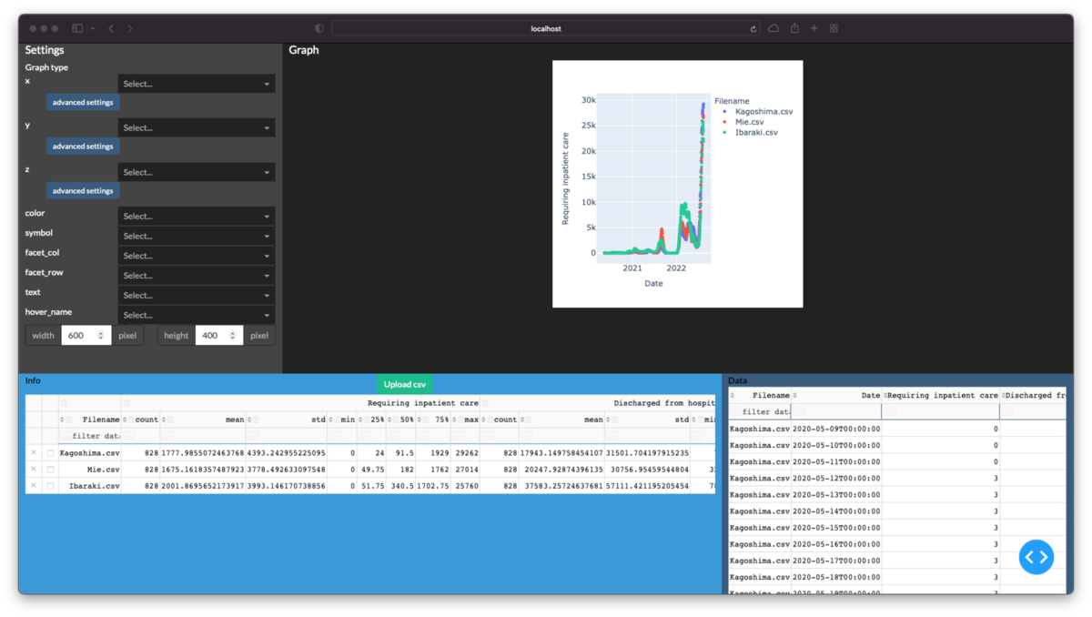
今回は表中のデータをグラフ化する部分です.
目標
下図の赤枠部分を作成します.
開発環境
前回の通りです.Pythonでpandasとdashをインストールして下さい.
アプリ作成
グラフ描画エリアの確保
次のコードを追加してグラフ描画エリアを作成します.
グラフ本体のdbc.Col(dcc.Graph(id='graph'))を2つのdbc.Col(width=0)`で挟むという一見無意味なレイアウトですがちゃんと理由はあります.
これはグラフをエリアの中央に配置するための苦肉の策です.
dash-bootstrap-componentsのレイアウトの水平配置の説明を見て頂くと察しがつくかもしれませんが,
グリッド配置の位置を明示的に指定せずに水平位置を均等配置するには2つ以上のコンポーネントが必要なようです.このため空要素で挟んで全体を中央揃えにしました.
空要素なしで頑張っても見ましたが,どうにもうまくできませんでした.
graph = [dbc.Row(dbc.Col(html.H5(['Graph']))),
         dbc.Row(
            [dbc.Col(width=0), dbc.Col(dcc.Graph(id='graph')), dbc.Col(width=0)],
            justify='center'# dbc.Rowの中身を中央揃えにする
            ),
        ]
できたらcontainerに追加します.
container = [
    dbc.Row(
        [dbc.Col([], width=3, class_name='bg-secondary',
                 style={'height': '60vh', 'overflow': 'scroll'},
            ),
         dbc.Col(
             graph, width=9, style={'height': '60vh', 'overflow': 'scroll'}),
        ],
        ),
    dbc.Row(
        [dbc.Col(table_info, width=8, class_name='bg-info text-black'),
         dbc.Col(table_detail, width=4, class_name='bg-primary text-black'),
        ], style={'height': '40vh'},
        ),
]
これでグラフの領域が確保できました.
表中のデータのグラフ化
アプリ中の表に出力中のデータをグラフにするために,次のコールバック関数を定義します.
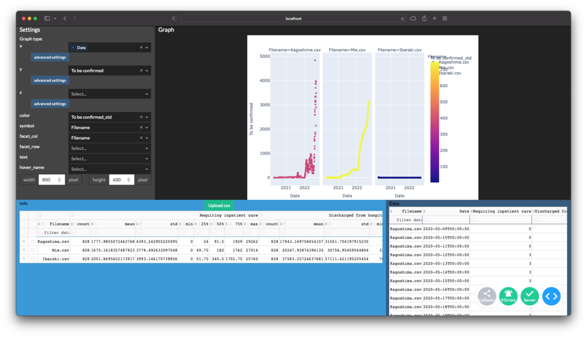
@app.callback(
    Output('graph', 'figure'),
    inputs={
        # フィルタ中のデータを使用するためにderived_virtual_dataを使用する
        'data_info': Input('table_info', 'derived_virtual_data'),
        'data_detail': Input('table_detail', 'derived_virtual_data'),
        },
    prevent_initial_call=True,
)
def update_graph(
        data_info, data_detail
    ):
    if len(data_info)==0:
        return go.Figure()
    df = pd.DataFrame(data_info)
    if len(data_detail)!=0:
        df = df.join(pd.DataFrame(data_detail).set_index('Filename'),
                     on='Filename', how='inner'
              ).reset_index()
    try:
        fig = px.scatter(df, x='Date', y='Requiring inpatient care',
                         color='Filename',
                        )
    except:
        fig = go.Figure()
    return fig

次回
x, y軸や色分けに使うデータをアプリ上で選択できるようにします.測定装置から出力されるデータをグラフ化したい場合,その軸は決まっていることが多いため正直蛇足なうえに,多分一番面倒です. 投稿しました
Pythonで測定装置のcsvファイルをグラフ化するアプリを作る(1. データ表示編)
こんなのを作りました. drive.google.com できることは
- 複数のcsvを開いてデータを表示する(後から追加も可)
- グラフ(散布図,折線,棒,円,ヒストグラム,散布図行列)を描ける
- 散布図と折線のグラフは3次元も描ける
- 軸を常用対数に変換
- 表示したデータの内,選択したデータやフィルターした結果のみをグラフに反映
- 不要な列の削除
- 色,点や線の形状,行,列でデータを区別
- グラフのサイズ変更
です.最初に測定条件や要約情報が記載された後に,測定値が続くタイプのcsvを念頭に置いています.

そこでエクセル(GUIアプリケーション)しか使えない方々でも簡単にグラフを確認できる(はずの)アプリを冒頭の通り作成してみました.
これのpythonでの作り方を順に公開していきます. 今回はcsvデータの表示です.
目標
下図の赤枠部分を作成します.開発中に毎回csvをGUIで選択するのは面倒なので,その機能は連載の最後に実装します.
開発環境
私の環境は次の通りです.必要に応じてパッケージをインストールして下さい.
- MacBook Pro(Mid 2014), macOS Big Sur
- Python 3.7.5
- numpy 1.20.0
- pandas 1.2.1: データ処理に使用
- plotly 5.10.0: グラフ描画に使用
- dash 2.6.1: アプリのGUIに使用
- dash-bootstrap-components 1.2.1
- dash-daq 0.5.0
データの準備
公開できる測定データが手元になかったので,まずはデータを取得するところから始めます. 今回は厚労省が公開している新型コロナウイルス感染者数に関するデータを使います. ダウンロードしたままですと例題としては都合が悪いため簡単に編集します.
from pathlib import Path
from datetime import datetime
import pandas as pd


df = pd.read_csv(
            'https://covid19.mhlw.go.jp/public/opendata/requiring_inpatient_care_etc_daily.csv',
            header=0, index_col=0
        )

wd = Path('COV19')
try:
    wd.mkdir(exist_ok=False)
except:
    pass

# 都道府県ごとに3列単位になっているのを切り分ける
for i in range(0,144,3):
    group = df.iloc[:, i:i+3]
    col = group.columns.str.extract(
                    r'\((?P<prefecture>.+)\) (?P<param>.+)', expand=True
                )
    prefecture = col['prefecture'].iat[0]
    group.columns = col['param']
    # 測定条件に相当する部分の作成
    data = f'''Title,入院治療等を要する者等推移
Prefecture,{prefecture}
Date,{datetime.now().strftime("%Y-%m-%d %H:%M")}
URL,https://covid19.mhlw.go.jp/public/opendata/requiring_inpatient_care_etc_daily.csv

'''
    # 要約情報の作成
    data += group.describe().to_csv()
    data += '\n\n'
    data += group.to_csv()
    with open(wd/f'{prefecture}.csv', 'w') as f:
        f.write(data)
これで「測定条件 + 要約 + 測定データ」の形式のcsvが手に入りました.
csvを表示する機能の作成
csvを読み込む用のクラス作成
上で準備したcsvをpandasで読み込むためのクラスを作成します. 今回は簡単に読めるのでクラスにする必要もありませんが,実際の装置データの場合は測定条件と要約,測定値でそれぞれ基底クラスを作成した方が楽でしょう.
from io import StringIO


class COV19(object):
    """csvを読み込みます.文字列を渡して解読させる方が後々で楽です.
    Attributes
    -----------
    header: pd.Series
        測定条件
    info: pd.DataFrame
        測定値の要約
    data: pd.DataFrame
        測定値
    """

    def load_string(self, string):
    """文字列の読み込み
    Parameter
    -----------
    string: str
        文字列化したcsvファイル
    """
        header, info, data = string.split('\n\n') # 今回のcsvは一番簡単な例として空行で分かれてます
        self.header = pd.Series(StringIO(header))
        self.info = pd.read_csv(StringIO(info), header=0, index_col=0)
        self.data = pd.read_csv(StringIO(data), header=0, index_col=0,
                                parse_dates=['Date']
                                )
        return self

    def load_file(self, filepath):
        with open(filepath, 'r') as f:
            self.load_string(f.read())
        return self
csvの読み込み
読み込み用クラスをfor文で回してdictに格納します.できたdictはpd.DataFrameに変換します.
要約情報の列名をpd.MultiIndexにしてしまいましたが,グラフ作成やデータの結合時などの取扱が大変面倒になります.
例えば次節のプログラム中で表(dash.DataTable)のidに渡すとエラーになります.
このためpd.MultiIndexは避けた方が自分が楽になります.
n_data = 3# 47都道府県+全国を毎回読むのは非効率のため上限を設ける
info = {}
data = {}
for root, dirnames, filenames in os.walk(Path.cwd()):
    for filename in filenames:
        if len(info)>=n_data:
            continue
        if not filename.lower().endswith('.csv'):
            continue
        filepath = Path(root)/filename
        with open(filepath, 'r') as f:
            cov = COV19().load_string(f.read())
        info[filename] = cov.info
        data[filename] = cov.data

df_info = pd.concat(info).unstack().rename_axis(['Filename'], axis=0)
col_flat = (['Filename'] + ['_'.join(c) for c in df_info.columns])
col_multi = [('', 'Filename')] + df_info.columns.to_list()
df_info = df_info.reset_index().set_axis(col_flat, axis=1)

df_detail = pd.concat(data).rename_axis(
            ['Filename', 'Date'], axis=0).reset_index()
画面への表示
まずは要約情報だけを表示し,その次に測定値のパーツを足します.表の使い方はdashの公式ドキュメントを確認して下さい.
今回は特に並べ替えとフィルタの部分を使用しています.
レイアウト作成についてはこちらのページが参考になりますが,
きちんと公式サイトを読んで引数に何が渡せるか確認しましょう.
またどんなテーマがいいかはこちらのサイトで比較できます.
dbc_css = "https://cdn.jsdelivr.net/gh/AnnMarieW/dash-bootstrap-templates/dbc.min.css"
app = Dash(external_stylesheets=[dbc.themes.DARKLY, dbc_css])


table_info = html.Div(
    [dbc.Row(
        [dbc.Col('Info'),
         dbc.Col(
             dcc.Upload(
                 dbc.Button('Upload csv', color='success'),
                 id='upload-csv', multiple=True
                 )
             ),
        ], justify='between',
        ),
     dbc.Row(
        [DataTable(
            data=df_info.to_dict('records'),
            columns=[
                {'name': m, 'id': f, 'deletable': True}
                    for f, m in zip(col_flat, col_multi)
                ],
            id='table_info', editable=True, filter_action='native',
            sort_action='native', merge_duplicate_headers=True,
            row_selectable='multi', row_deletable=True,
            style_table={'overflow': 'auto', 'height': '40vh'},
            ),
        ]
        )
     ]
 )

container = [
    dbc.Row(
        [dbc.Col(table_info, class_name='bg-info text-black')],
        style={'height': '40vh'}
        )
]
app.layout = dbc.Container(container, fluid=False)

if __name__=='__main__':
    app.run_server(debug=True)
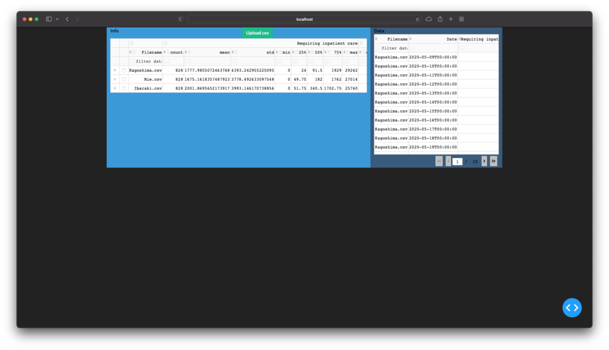
ここまでを実行し,ブラウザのURL欄にlocalhost:8050を入力して開くと次の画像のようになるはずです.
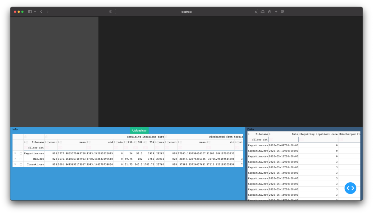
次に測定値のパーツを作成します.それをcontainerに追加するとwebページに反映できます.
# table_infoの定義部分

table_detail = html.Div(
    ['Data',
     DataTable(
         data=df_detail.to_dict('records'),
         columns=[{'name': i, 'id': i} for i in df_detail.columns],
         id='table_detail', editable=True, filter_action='native',
         sort_action='native',
         style_table={'overflow': 'scroll', 'height': '40vh'}# scrollの設定がないとページが長くなったりエリア分けを突き抜けたりします
         ),
     dcc.Store(id='store_detail', data=df_detail.to_json(orient='records')),# 後で使います
    ]
)

container = [
    dbc.Row(
        [dbc.Col(table_info, width=8, class_name='bg-info text-black'),
         dbc.Col(table_detail, width=4, class_name='bg-primary text-black'),
        ],
        style={'height': '40vh'}
        )
]
フィルター機能の搭載
「とりあえず全部開いたけどやっぱり個別に確認したい」ということはよくあります.なので要約情報の表でチェックをつけたファイルのみを表示できるように, 次のコールバック関数を追加します.またこの関数によって要約情報の表でフィルタかけると測定値の表にも反映されるようになります.
@app.callback(
    Output('table_detail', 'data'),
    Output('table_detail', 'columns'),
    Input('table_info', 'derived_virtual_selected_rows'),
    Input('store_detail', 'data'),# 別の場所からコピーしないと選択されなかったデータが消えます
    State('table_info', 'derived_virtual_data'),# フィルタ済みのデータを使用します
    #prevent_initial_call=True,
)
def select_file(selected_rows, data_detail, data_info):
    # 起動時は[]ということになっているが,Noneになっていてエラーになる場合に対処
    if data_info is None:
        data_info = []
    df_info = pd.DataFrame(data_info)
    if data_detail is None:
        df_detail = pd.DataFrame()
    else:
        df_detail = pd.read_json(
                        data_detail, orient='records', convert_dates=['Date'])
    if selected_rows is None:
        selected_rows = []
    if len(selected_rows)!=0:
        filenames = df_info['Filename'].iloc[selected_rows].to_list()
        df_detail = df_detail.loc[
            lambda d: d['Filename'].apply(lambda x: x in filenames)
        ]
    columns=[{'name': i, 'id': i} for i in df_detail.columns]
    return df_detail.to_dict('records'), columns
アプリ上で表を配置する
主役たるグラフの下に表を配置するように設定します.
container = [
    dbc.Row(
        [dbc.Col([], width=3, class_name='bg-secondary',
                 style={'height': '60vh', 'overflow': 'scroll'},
            ),
         dbc.Col(
             [], width=9, style={'height': '60vh', 'overflow': 'scroll'}),
        ],
        ),
    dbc.Row(
        [dbc.Col(table_info, width=8, class_name='bg-info text-black'),
         dbc.Col(table_detail, width=4, class_name='bg-primary text-black'),
        ], style={'height': '40vh'},
        ),
]
app.layout = dbc.Container(container, fluid=True)# 画面全体を使うようにfluid=Trueに変更
次回
ImageJ fijiのTrainable Weka Segmentationを使ってSEM画像から粒子を抽出する
目的
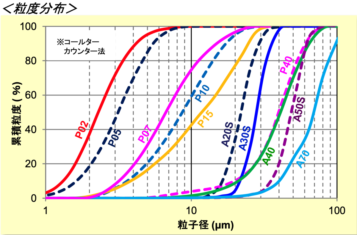
粒子のSEM像から粒度分布を取得したい.そのためにまず画像から粒子を抽出する.
必要なもの
- 粒度分布を知りたい粒子の(SEM)画像
- ImageJ fiji
手順
以前に粒子画像を自動で分析する方法を投稿したが,今回の画像は粒子抽出の難易度が高すぎたためGUIでポチポチ頑張る.知っていれば難しくない.
画像取得時の注意点
粒子はなるべく重なっていない方がいい.明るさやコントラスト,ピンボケ,ノイズはまだ後からどうとでもなる.また画像の形式はtiffやpngなどの非圧縮を強く推奨.tiffであれば長さの情報も埋め込めるため便利.圧縮形式のjpgなどは間違っても使わないこと.
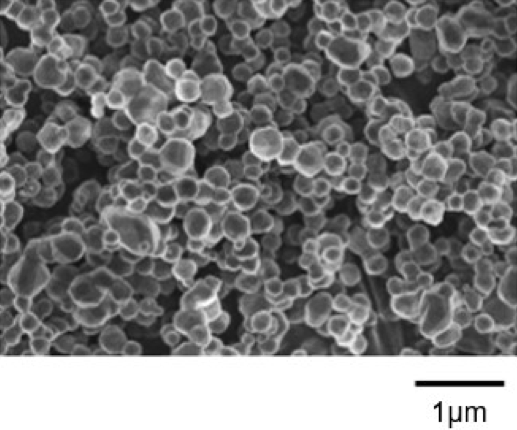
手持ちに使える画像がないため,今回はインターネット上のカタログをスクショして借用する.
重なっていない画像の例


重なりすぎてどうにもならない画像の例
下準備
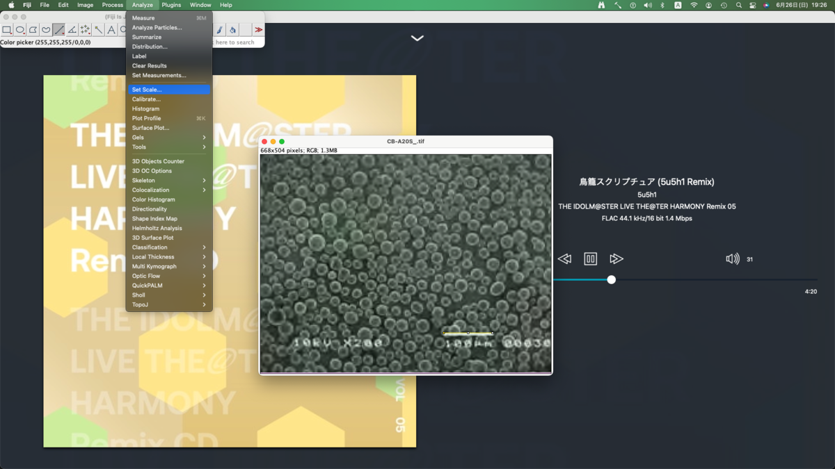
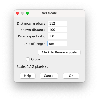
画像中の長さの設定
直線ツールでスケールバーに合わせた線を引いた状態でmenu bar > Analyze > Set Scaleから設定する.
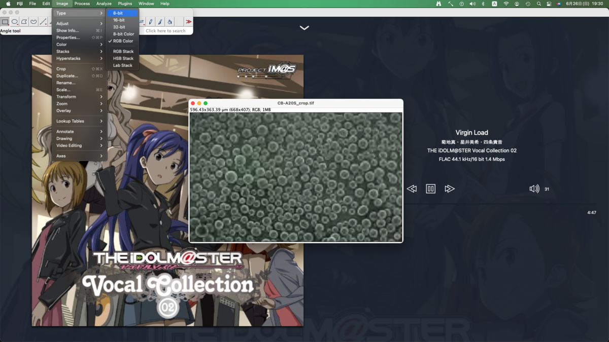
グレースケールに変換
諸々の処理はカラー画像では実行できないためグレースケールに変換する.
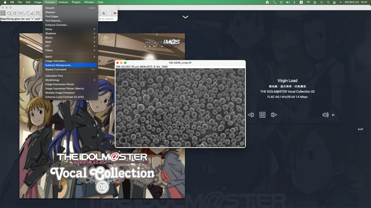
背景の明るさの調整
今回は不要そうだが念の為.光学画像で光源方向が明るい場合は分析に支障が出る可能性がある.それに対処する.
画像分析
領域分割(Trainable Weka Segmentation)
実は当初はopencvで粒子の抽出を試みたのだが,今回のように境界(表面)が反射して白く光っている画像は扱いが難しくて挫折した.画像分析の自動化や分析結果の取り扱いまで考えるとJythonでなくCythonにしたかったが仕方がない.menu bar > Plugins > Segmentation > Trainable Weka Segmentationから起動する.
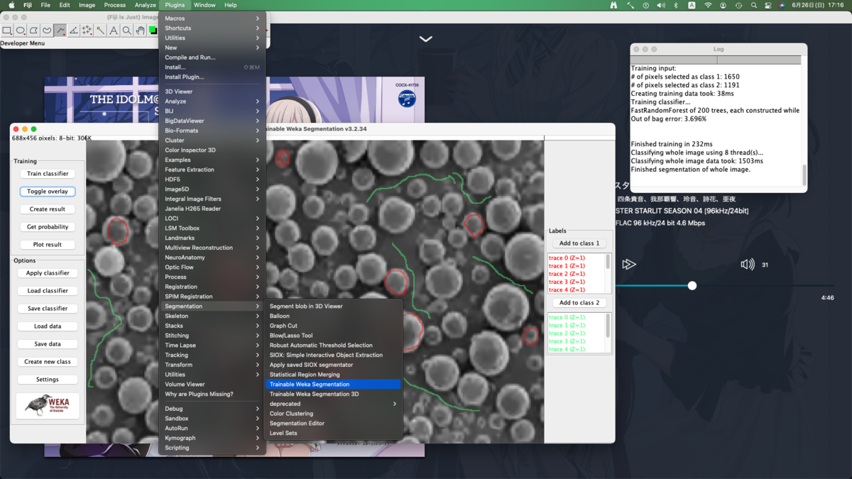
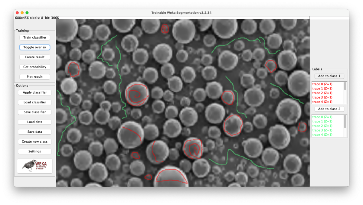
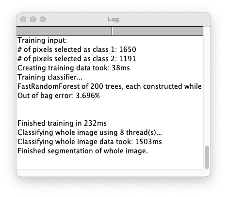
同様の画像を全く同じ条件で色分けするために,今回の分類器(classifier)をSave classifierで保存しておく.こうすると次回からはLoad classifierで分類器を読み込んで使い回せる.いつ誰がやっても同じ結果が得られる.なおどこをなぞったかを保存する術はないため,必要であればスクリーンショットを撮っておくこと.
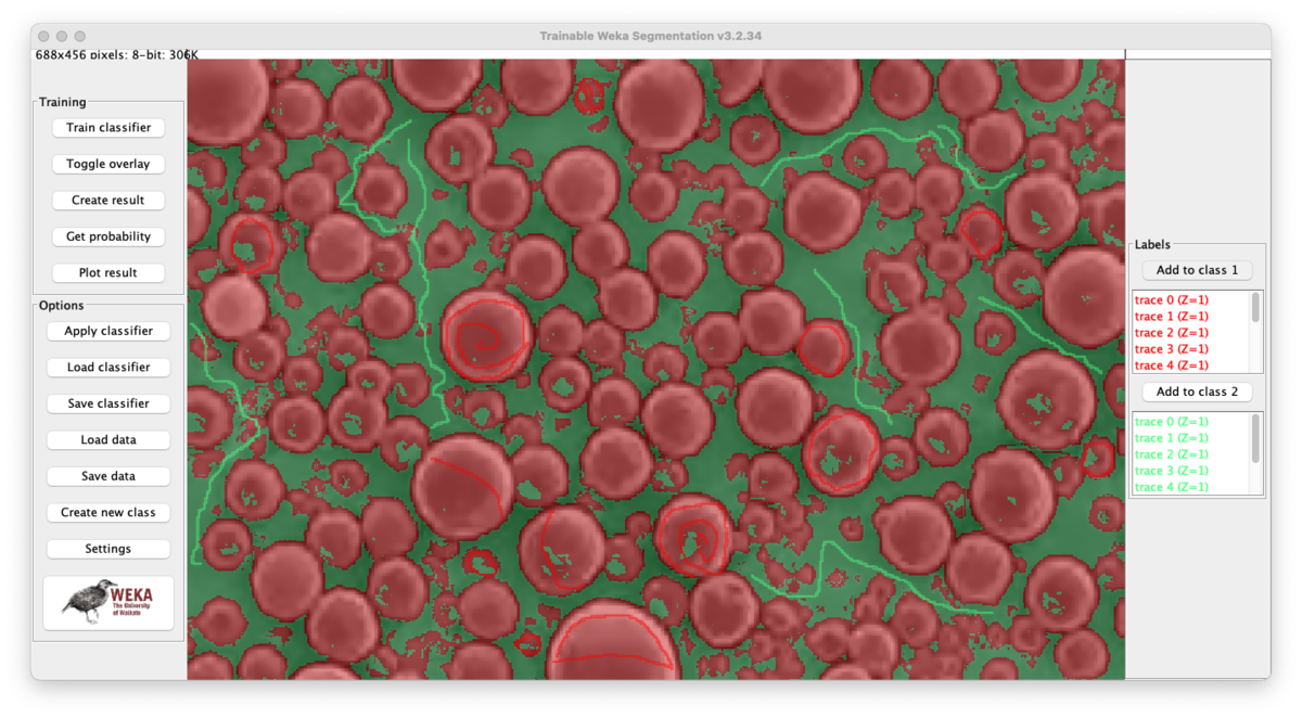
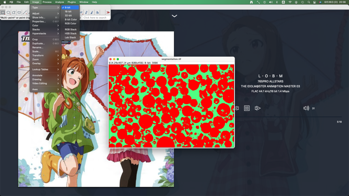
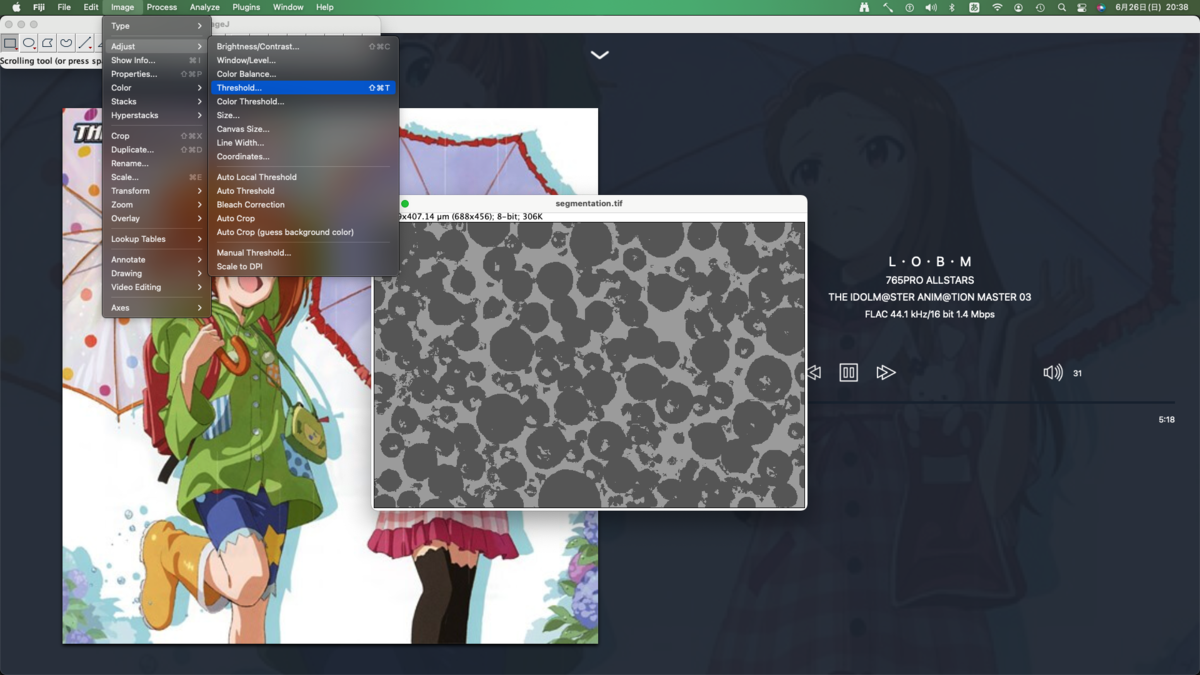
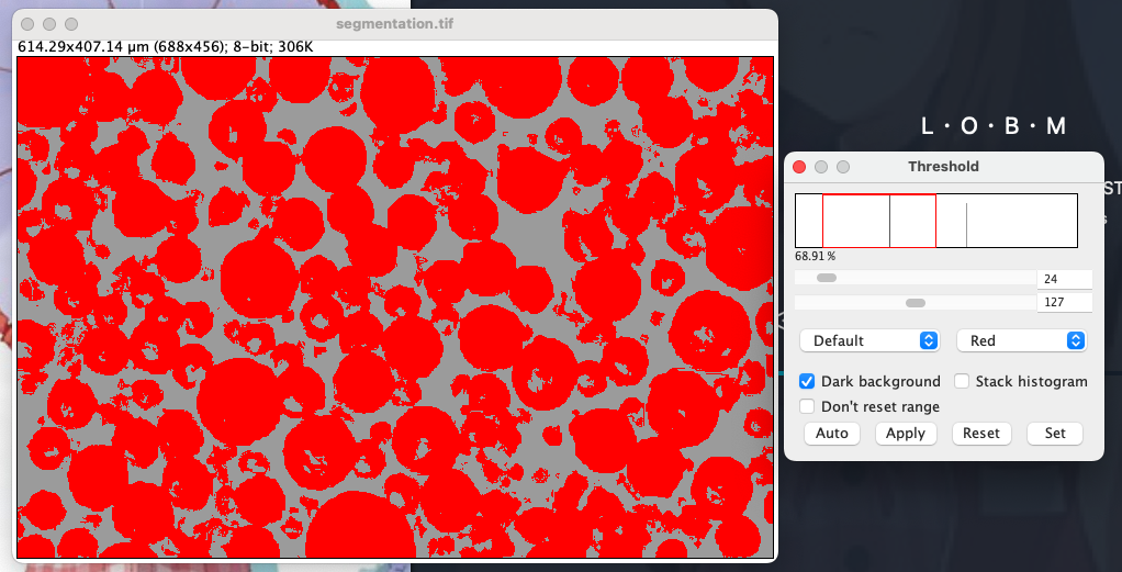
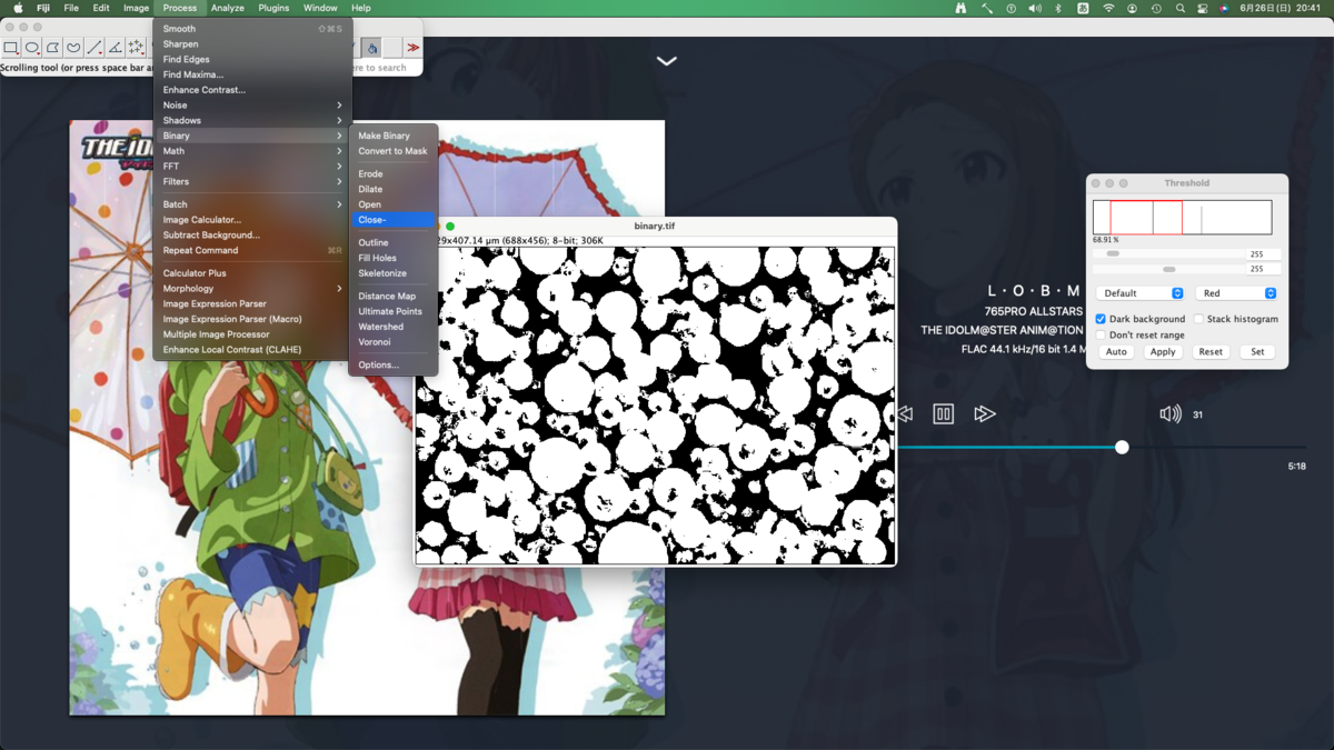
二値化(threshold)
分類器の出力はカラーになっているため白黒に変換する.まずはグレースケールに変換する.
粒子の穴を塞ぐ(close)
領域分割時に諦めた穴に対処する.まず小さな穴は簡単に埋められる.

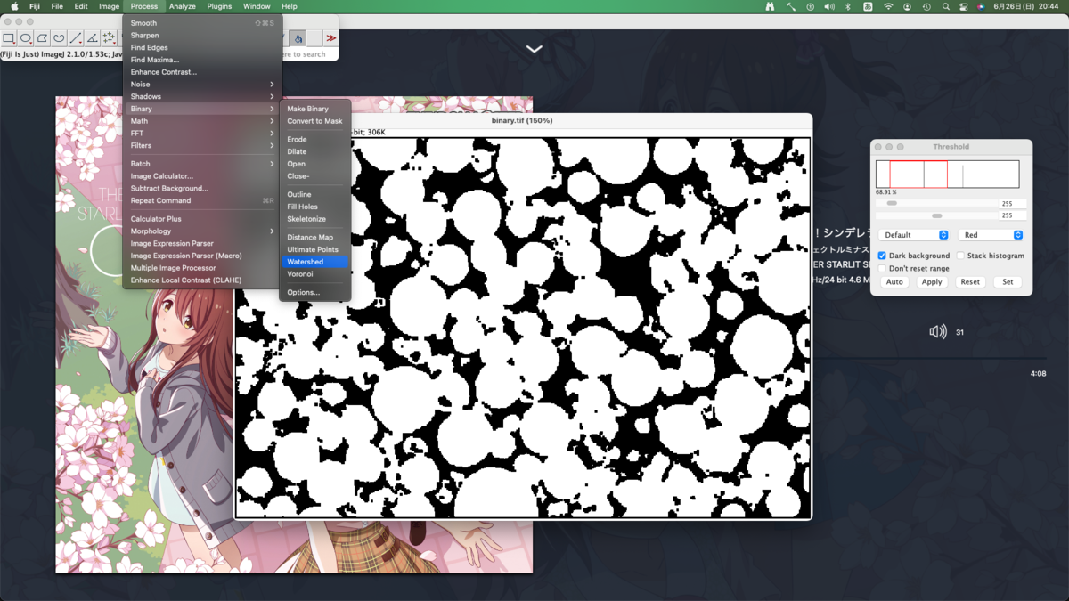
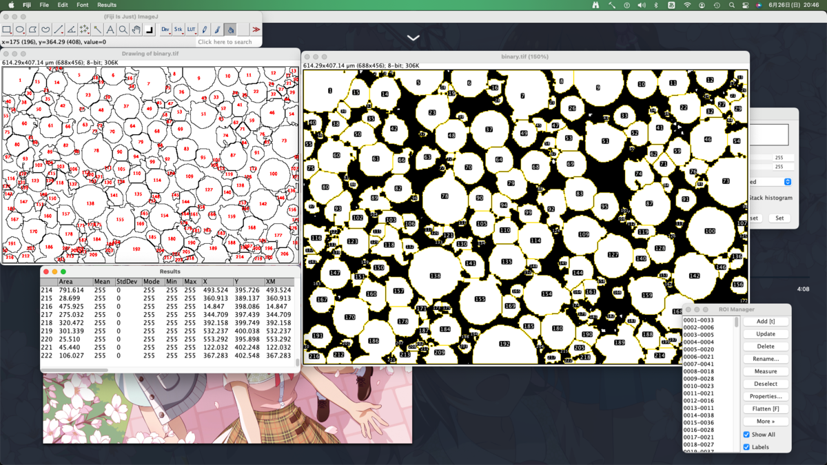
繋がっている粒子を分割する(watershed)
粒子どうしが繋がったままだと正常に分析できないため分割する.先の住友化学の例レベルだとどうにもならない.また粒子に穴が空いたままでもうまくいかない.
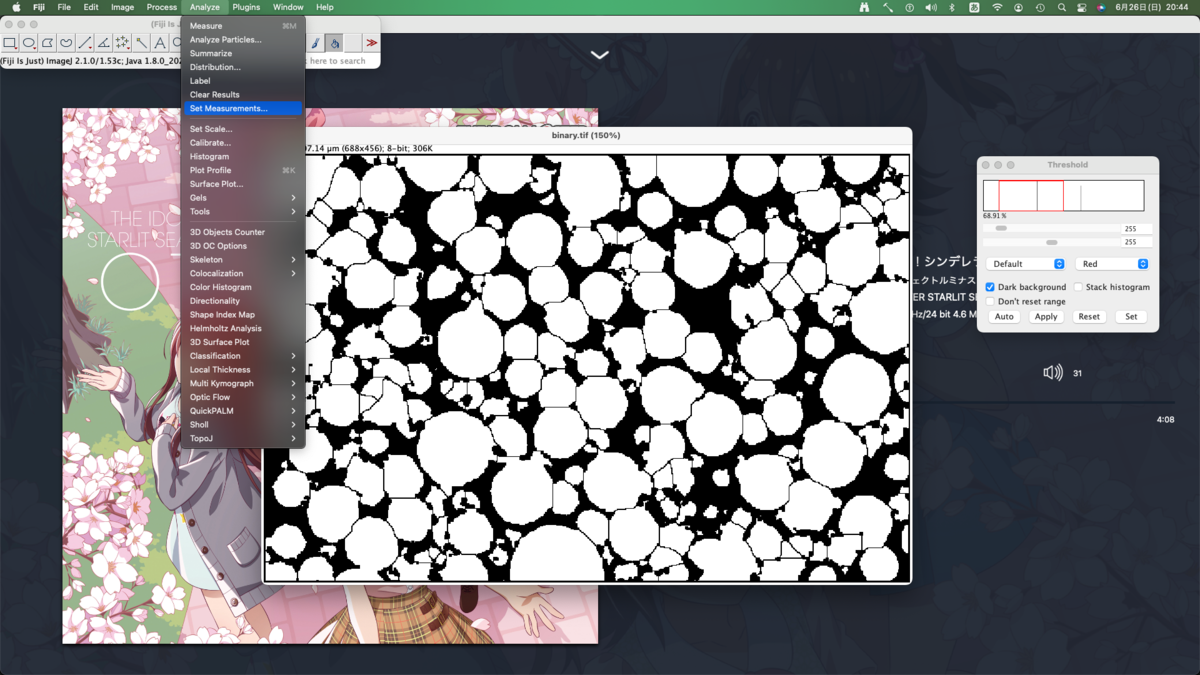
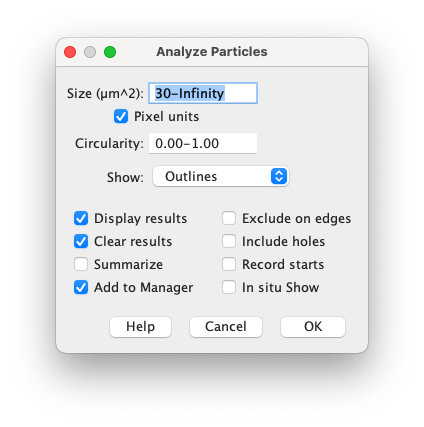
粒子の分析
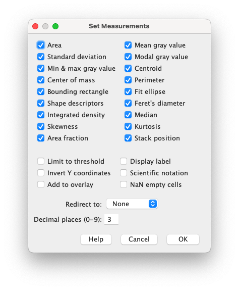
まず分析項目を選択する.まあ全部選んでおいて後で必要なものを考えれば良いでしょう.

QNAPのNASでリモートからローカルにデータを同期する
環境
ローカル(バックアップ先)
すなわち外部からの接続はできない
リモート(元データ)
- NAS: TS-231P, QTS 5
- IP: LAN側をDHCPで固定,WANも固定
- DDNS: myQNAPcloud(WAN側IP固定なので不要)
- ポート転送: openVPNのサービスポートへ接続
openVPNでリモートアクセスが可能.
目的
実家(ローカル)から自宅(リモート)のデータを引っ張ることを考える. 愛知–茨城の距離(約500 km)でバックアップを試みる.
作業
リモート(前準備)
- 外部ネットワークからNASに接続できるようにする
- ローカル(実家)に移す用のHDDにデータを入れておく
この手順に従う.
外部からNASに接続できるようにする
最悪,バックアップ用のサービス(RTRRやRsync)のポートをWANに開放すれば目的は達成できるが, セキュリティ上そんな選択肢はない. そこでVPNの使用が考えられる.私はルータのVPNでなくNASのopenVPNを選択した. NAS側でVPNサーバを立ち上げた方が 引越でプロバイダが変わっても再設定が楽だろう. なお最新のVPNであるWireGuardはIntel CPU(x86)を積んだモデルでないと使えない.残念.
ローカル用HDDにデータをコピーしておく
2ベイ以上のモデルで冗長性のあるRAIDを組んでいるなら,ホットスワップでデータを丸ごとコピーしておく. USB接続でポータブルHDDに移した方がコピーにかかる時間は短いが,ホットスワップしてしまった方が実家でNASを再設定する手間が軽減できる.
ローカル
NASにHDDを搭載する
新品のNASにリモートから運んだHDDを挿して起動するだけ.起動してしばらくするとリモートの環境がほぼ再現される. IP競合やサブネットが異なるなどでPCから接続できない場合は, 音が鳴るまでリセットボタンを押すとネットワーク設定のみ初期化される. リセットに追い込まれて初めて知ったのだが, QTS4.4.2以降ではadminの初期パスワードはMACアドレスに変更されている.どうせ秒で変えてadminも無効化するがいい変更だと思う.
リモートNASに接続する
VPN接続を行うだけ.ちゃんとVPNをゲートウェイにするようにしないと当然繋がらないため注意.
アクティブ同期する
Hybrid Backup Syncの同期から設定していくだけ. ナビも分かりやすいためリモート接続さえできていれば問題ない.ただしリモートのRTRRやRsyncのサービスポートはデフォルトから変更しておくこと. 同期のルールで「ファイルコンテンツを確認する」を選択するとバイト単位で変更の確認が行われて永遠に終わらないため注意.
課題
リモートLAN内でRTRRサービスポートがパスワードでしか保護されていない
簡単にデータを丸ごとコピーできるのにこれはちょっと・・・. 対策はRTRRを使わずrsyncを使い,その接続もsshポートフォワーディングに限り,rsyncへの接続はfirewallでローカルに限定するということになる. firewallを信じよう.