Pythonで測定装置のcsvファイルをグラフ化するアプリを作る(4. グラフ種類の変更編)
続きものです.こんなのの作り方を公開していきます. drive.google.com
これまで3回に分けて公開しています.
今回は散布図以外のグラフも描画できるようにします.以前までのも含めてコードはご自身の責任でご自由にご使用下さい.
目標
折線,棒,ヒストグラム,円,散布図行列を実装する.
環境
今まで通りPythonでpandasとdashをインストールして下さい.
実装
グラフの種類を選べるプルダウンを作成する
軸のように表に合わせて選択肢を変える必要はないので打ち込んで完成です.
graph_type = dbc.Row(
    [dbc.Col(['Graph type']),
     dbc.Col(
         [dcc.Dropdown(
                options=[
                    {'label': '散布図','value': 'scatter'},
                    {'label': '折線', 'value': 'line'},
                    {'label': '棒', 'value': 'box'},
                    {'label': 'ヒストグラム', 'value': 'histogram'},
                    {'label': '円', 'value': 'pie'},
                    {'label': '散布図行列', 'value': 'scatter_matrix'},
                    ],
                id='graph-type', value=None,
                className='dbc', style={'width': '15vw', 'float': 'right'},
                ),
         ]
         ),
    ]
)

graph_settings = [
    html.H5(['Settings']),
    graph_type,# 追加
    Axis('x').make_component(multi=True),
    Axis('y').make_component(multi=False),
    Axis('z').make_component(multi=False),
    Components('color').make_dropdown(),
    Components('symbol').make_dropdown(),
    Components('facet_col').make_dropdown(),
    Components('facet_row').make_dropdown(),
    Components('text').make_dropdown(),
    Components('hover_name').make_dropdown(),
    dbc.Row(
        [dbc.Col(
             dbc.InputGroup(
                 [dbc.InputGroupText('width'),
                  dbc.Input(value=600, type='number', id='graph-width'),
                  dbc.InputGroupText('pixel')
                 ]
                 )
             ),
         dbc.Col(
             dbc.InputGroup(
                 [dbc.InputGroupText('height'),
                  dbc.Input(type='number', value=400, id='graph-height'),
                  dbc.InputGroupText('pixel')
                 ],
                 )
             )
        ],
        ),
]
選択肢に合わせて描画する関数を追加する
グラフを生成する関数とアプリに表示する関数を分けます.生成関数を次のように作ります. 描画関数によって受け取れる引数が異なることへの対応が主な処理になっています.
def drawer_px(graph_type, graph_kws, axis_ranges, log_axis):
    if graph_type!='scatter_matrix':
        # 散布図行列以外は軸のパラメータを1つだけ受け取る
        graph_kws['x'] = graph_kws['x'][0]
    # plotly.expressの関数を選択する
    # 散布図と折線は3次元用の関数があるためz軸を与えられたかでさらに分岐する
    if graph_type=='scatter':
        if graph_kws['z'] is None:
            drawer = px.scatter
            graph_kws.pop('z')
        else:
            drawer = px.scatter_3d
            graph_kws.pop('facet_col')
            graph_kws.pop('facet_row')
    elif graph_type=='line':
        if graph_kws['z'] is None:
            drawer = px.line
            graph_kws.pop('z')
        else:
            drawer = px.line_3d
            graph_kws.pop('facet_col')
            graph_kws.pop('facet_row')
    else:
        graph_kws.pop('z')
        graph_kws.pop('text')
        drawer = None
        if graph_type=='box':
            drawer = px.box
            graph_kws.pop('symbol')
        elif graph_type=='histogram':
            drawer = px.histogram
            graph_kws.pop('symbol')
        elif graph_type=='pie':
            graph_kws.pop('symbol')
            drawer = px.pie
            graph_kws['names'] = graph_kws.pop('x')
            graph_kws['values'] = graph_kws.pop('y')
        elif graph_type=='scatter_matrix':
            drawer = px.scatter_matrix
            graph_kws['dimensions'] = graph_kws.pop('x')
            graph_kws.pop('y')
            graph_kws.pop('facet_col')
            graph_kws.pop('facet_row')

    for key in 'xyz':
        if key not in graph_kws.keys():
            continue
        keymin = axis_ranges[f'{key}min']
        keymax = axis_ranges[f'{key}max']
        if (keymin is not None
            and keymax is not None
            ):
            graph_kws[f'range_{key}'] = [keymin, keymax]
        graph_kws[f'log_{key}'] = log_axis[f'log_{key}']
    return drawer, graph_kws
アプリへグラフを表示する関数は次のように書き換えます.
@app.callback(
    Output('graph', 'figure'),
    inputs={
        'data_info': Input('table_info', 'derived_virtual_data'),
        'data_detail': Input('table_detail', 'derived_virtual_data'),
        'graph_type': Input('graph-type', 'value'),
        'graph_kws': {
            key: Input(f'graph-{key}', 'value')
                for key in dropdowns + ['width', 'height']
            },
        'log_axis': {f'log_{x}': Input(f'graph-log_{x}', 'on') for x in 'xyz'},
        'axis_ranges': {
            f'{key}': Input(f'{key}', 'value')
                for key in [f'{x}min' for x in 'xyz']+[f'{x}max' for x in 'xyz']
            },
        },
    prevent_initial_call=True,
)
def update_graph(
        data_info, data_detail, graph_kws, axis_ranges, log_axis, graph_type,
    ):
    if len(data_info)==0:
        return go.Figure()
    df = pd.DataFrame(data_info)
    if len(data_detail)!=0:
        df = df.join(pd.DataFrame(data_detail).set_index('Filename'),
                     on='Filename', how='inner'
              ).reset_index()
    if graph_kws['x'] is None:
        graph_kws['x'] = [None]
    if len(graph_kws['x'])==1 or graph_type=='scatter_matrix':
        # plotly.expressの関数とそれに直接渡せるキーワード引数を受け取る
        drawer, graph_kws = drawer_px(
                    graph_type, graph_kws, axis_ranges, log_axis
                    )
        try:
            fig = drawer(df, **graph_kws)
        except:
            fig = go.Figure()
    else:
        fig = go.Figure()
    return fig
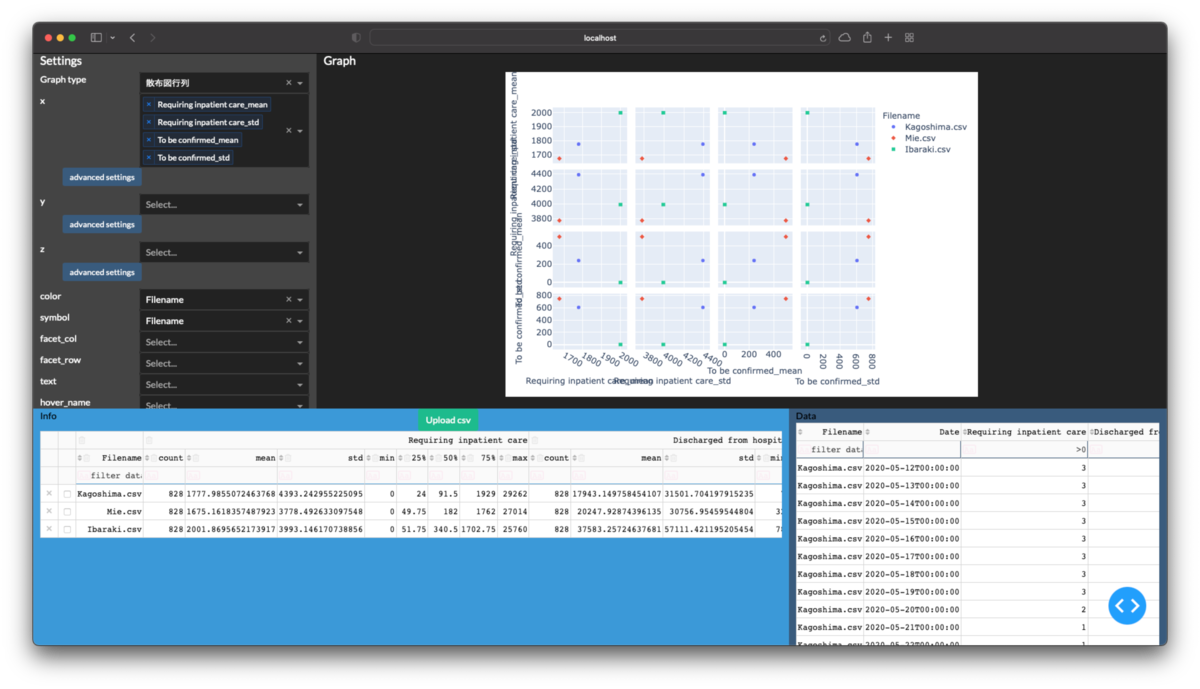
ここまでできると3次元の折線グラフや散布図行列は次のように描画できます.